
Inflation Threshold Forecasts - Method #3 (last 3 months)
This is a third alternative method of forecasting the time when Axial Seamount will reach the inflation level reached before the 2015 eruption started. We have found that Forecasting Method #1 and Forecasting Method #2 have not been ideal, so we are trying a third. Method #1 is "noisy" because the single-station de-tided BPR depths include tidal residuals and oceanographic effects; it uses an average rate of uplift from the last 3 months. In contrast, Method #2 uses DEPTH DIFFERENCES between two stations (removing the common sources of noise) to calculate a differential inflation rate; it used an average rate of uplift from the last 1 month. This was better, but the time-period for averaging the rate of uplift seems to be too short, so in Forecasting Method #3 (this page), we are averaging the rate of uplift over the last 3 months to extrapolate into the future to when the differential level of inflation will reach: (1) the level when the 2015 eruption started, and (2) a level 20 cm higher than in 2015 (which is somewhat arbitrary, but is included because the level of inflation in 2015 was higher than the level reached before the 2011 eruption). These plots are updated once a day using the latest data from the OOI-RCA.
Note: the rate of inflation is variable and so the forecast dates will also vary with time. The histogram and scatter plots below show the dates where most of the forecasts have fallen (up until we reached the 2025 threshold when we stopped updating those plots). When the 12-week inflation rate gets very low, updating of these plots is suspended until the rate returns to higher levels. Specific forecasts based on these plots are described on our Eruption Forecast Blog.
LINK BACK TO MAIN PAGE
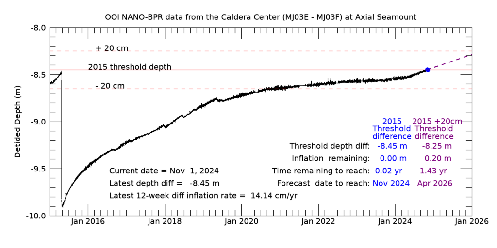
Plot of differential inflation from the Eastern Caldera BPR (MJ03E) minus the Central Caldera BPR (MJ03F) as the black curve showing deflation during the 2015 eruption (left) followed by re-inflation. If the rate is positive, a blue dashed line extrapolates into the future using the average rate of differential inflation from the last 3 months; middle blue dot is date when 2015 inflation threshold is reached, right purple dot is when a threshold 20 cm higher will be reached. Specifics are included in the legend on the plot.
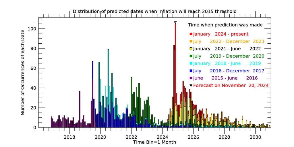
Histogram of predicted dates when Axial Seamount will reach the 2015 threshold, color coded by when the predicted date was calculated. Predicted dates were calculated based on the average rate of differential inflation from the previous 3 months, beginning in June 2015. Predicted dates are binned in months. We stopped updating this plot after the 2015 threshold was exceeded.
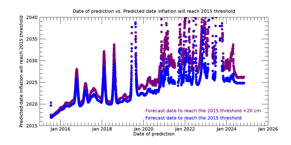
Plot of Predicted date that inflation will reach the 2015 inflation threshold (Y-axis) vs. Date on which the prediction was made (X-axis), using the average rate of inflation from the previous 3 months, starting in June 2015. Blue dots are date to reach the 2015 inflation threshold; purple dots are for a threshold 20 cm higher (as in the first plot above). Note predicted dates were earliest when the rate of re-inflation was highest, soon after the 2015 eruption (left side of plot). Peaks in the curves show time periods when the average rate of inflation slowed significantly, which pushed the predicted dates farther into the future.
We stopped updating this plot after the 2015 threshold was exceeded.